Getting Started:
Hover over [Systems] → click on the [Auto-Debit System®] → [Statistics] → [Monthly Revenue Analyzer™].

This is a convenient and fast way to see patterns in your business growth.
- The green line represents the Average Monthly Revenue for the 12 months prior to that month. Since we are looking at the period of months just prior to that month, it's referred to as a "Running Average."
- The purple bars each represent the net revenue for that month.
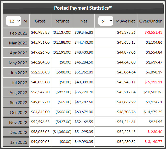
- The "Net Revenue" is calculated by subtracting any refunds or returns from the sum of accepted payments in any given month.

Analyzing the Graph:
- A graph rising in height (from left to right) indicates growth
- The green line is an indicator of the general direction your business is going
- Consistently seeing the purple bars rise above the green line indicates that your business is doing better than its average, indicating continued growth. Purple bars below the green line indicate lower-than-average performance.
Click on the [Data] tab in the top-left to see a detailed report of your monthly revenue. The Over/Under column represents the amount of revenue above or below that month's average.
You can change the number of months you are looking at as well as the number of months to average by clicking on the drop-down menu next to the letter [M] and [M Ave Net]. We recommend you look at 12 monthly averages, however, it is also smart to compare your current income to your past income as often as possible.